Appearance
CSS 部分
1 什么是 BFC?BFC 有什么作用?
1.1 BFC 概念
块格式化上下文(Block Formatting Context , BFC) 是 Web 页面的可视化 css 渲染的一部分,是块盒子的布局过程发生的区域,也是浮动元素与其他元素交互的区域。(在 BFC 内部,块级元素的布局、浮动元素与其他元素的相互作用,会受到 BFC 规则的影响)
- BFC(block formatting context)块级格式化上下文,他是页面中的一块渲染区域,并且有一套属于自己的渲染规则,他决定了元素如何对齐内容进行布局,以及与其他元素的关系和相互作用。当涉及到可视化布局的时候,BFC 提供了一个环境,HTML 元素在这个环境中按照一定规则进行布局;
- BFC 是一个独立的布局环境,具有 BFC 特性的元素可以看作是隔离的独立容器,容器里面的元素不会在布局上影响到外面的元素。
- BFC(Block Formatting Context)是 Web 页面中的一个独立渲染区域,具有自己的渲染规则,会影响元素的布局方式并隔离元素。主要的作用就是解决布局问题。
1.2 BFC 的布局规则
- 内部的盒子会在垂直方向,一个个地放置,每个块元素独占一行。
- 盒子垂直方向的距离由 margin 决定,属于同一个 BFC 的两个相邻 Box 的上下 margin 会发生重叠。
- 每个元素的左边,与包含的盒子的左边相接触,即使存在浮动也是如此。
- BFC 的区域不会与 float box 重叠。
- BFC 就是页面上的一个隔离的独立容器,容器里面的子元素不会影响到外面的元素,反之也如此。
- 计算 BFC 的高度时,浮动元素也参与计算。
1.3 形成 BFC 的条件
- float 除了 none 以外的值,为 left、right - 缺点要清除浮动
- overflow 除了 visible 以外的值,为 auto、 scroll、hidden - 缺点可能会截取定位子元素
- display 为 inline-block、table-cell、table-caption 、flex、inline-flex、grid、inline-grid 中的任何一个 - 缺点结构要变化
- position 为 absolute 或 fixed - 缺点需要更改布局方式
- contain: layout
1.4 BFC 的使用场景
1.4.1 如何让浮动元素和周围的内容等高?
html
<style>
/*
float + display + overflow + position
1.float: right | left; 父元增添浮动后,仍然要清除浮动
2.display:inline-block | tabel-cell | table-caption 等更改容器格式不推荐
3.position:absolute | fixed 更改布局方式不推荐
4.overflow: auto | scroll | hidden
> overflow:hidden 额外的影响相对较少
*/
.box {
background: red;
/* overflow:hidden 即可 */
}
.float {
width: 200px;
height: 200px;
background: white;
border: 1px solid black;
padding: 10px;
float: left;
}
</style>
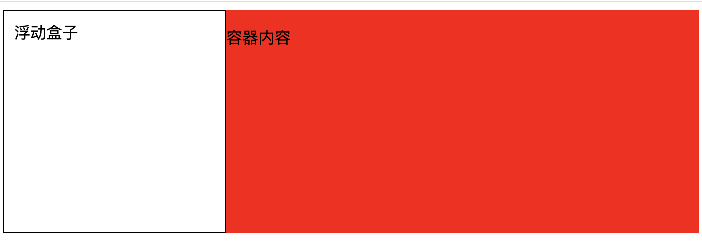
<div class="box">
<!-- 问题在于:未计算浮动元素的高度。让父容器变成BFC即可 -->
<div class="float">浮动盒子</div>
<p>容器内容</p>
</div>1.4.2 如何解决垂直方向 margin 合并问题?
同一个 BFC 的两个相邻 Box 的上下 margin 会发生重叠。
html
<style>
    .block1 {
      width: 200px;
      height: 200px;
      background: blue;
      margin-bottom: 20px;
    }
    .block2 {
      width: 200px;
      height: 200px;
      background: blue;
      margin-top: 40px;
    }
  </style>
</head>
<body>
  <div class="block1">第一个块级元素</div>
  <div class="block2">第二个块级元素</div>
</body>解决方案
将两个块元素隔开,可以得到 margin 的正常解析
添加父元素包裹下方元素 - 为父元素增添边框,可以阻止 margin 溢出,缺点就是多了个边框。
html
<div class="block1">第一个块级元素</div>
<div class="parent" style="border-top: 1px solid transparent">
  <div class="block2">第二个块级元素</div>
</div>- 添加父元素包裹下方元素 - 为父元素设置 padding 代替子元素 margin
css
.block2 {
  width: 200px;
  height: 200px;
  background: yellow;
}
.parent {
  padding-top: 100px;
}- 添加父元素包裹下方元素 - 为父元素设置 overflow:hidden 属性,产生 BFC,缺点是如果子元素有定位可能会被 hidden 掉
html
<div class="block1">第一个块级元素</div>
<div class="parent" style="overflow: hidden">
  <div class="block2">第二个块级元素</div>
</div>- 添加父元素包裹下方元素 - 通过伪类增添平级的 BFC 渲染区域,通过 BFC 进行隔离
css
.parent::before {
  content: "";
  display: table;
}以上方式同样可以解决垂直方向 margin 溢出问题。
1.4.3 如何实现自适应的两列布局?
- BFC 的区域内的元素不会与 float box 重叠。
html
<style>
    /*
      1.层叠上下文,层叠顺序,浮动 > 块元素
      2.浮动后形成BFC,外部元素无法进入BFC区域,浮动后则是两列布局。
    */
    .aside {
      width: 100px;
      height: 150px;
      background: pink;
      float: left;
    }
    .main {
      height: 200px;
      background: red;
    }
  </style>
</head>
<body>
  <div class="aside">菜单</div>
  <div class="main">内容</div>
</body>- 利用 float 的元素不能进入 BFC 区域的特点
html
<style>
  /*
    1.层叠上下文,层叠顺序,浮动 > 块元素
    2.BFC的区域不会与 float box 重叠。
  */
  .aside {
    width: 100px;
    height: 150px;
    background: pink;
    float: left;
  }
  .main {
    height: 200px;
    background: red;
    overflow: hidden;
  }
</style>
<body>
  <div class="aside">菜单</div>
  <div class="main">内容</div>
  <!-- 右边元素overflow:hidden后,形成BFC区域,左边的float元素就不能进入右边范围了 -->
</body>1.4.4 如何防止高度坍塌?
- 当父级高度消失时,初学者的第一反应就是给父元素设置固定高度,这个是不正确的思路 ❌
- 父元素高度应由内容撑起,我们是很难提前确定父元素的高度的。
html
<style>
  header,
  footer {
    background: red;
    height: 60px;
  }
  .main-left {
    background: yellow;
    width: 300px;
    height: 300px;
    float: left;
  }
  .main-right {
    background: orange;
    width: 300px;
    height: 300px;
    float: right;
  }
</style>
<div>
  <header>头部</header>
  <div class="main-left">左侧</div>
  <div class="main-right">左侧</div>
  <footer>底部</footer>
</div>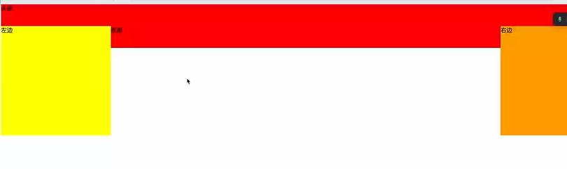
- 方案 1:为父元素设置 overflow:hidden 属性。 (缺陷:如果子元素有定位可能会被 hidden 掉)
html
<header>头部</header>
<!-- 创建BFC区域,计算 BFC 的高度时,浮动元素也参与计算。 -->
<div style="overflow: hidden">
  <div class="main-left">左侧</div>
  <div class="main-right">左侧</div>
</div>
<footer>底部</footer>- 方案 2:在父元素的结尾追加一个空子元素(块级元素),并让子元素清除浮动影响。(缺陷:平白无故多出个空元素)
html
<header>头部</header>
<div>
  <div class="main-left">左侧</div>
  <div class="main-right">左侧</div>
  <!-- 利用 clear:both 属性和父元素必须包含非浮动元素两个原理 -->
  <div style="clear: both"></div>
</div>
<footer>底部</footer>- 方案 3:完美解决方案:为父元素末尾伪元素设置 clear:both
css
.after::after {
  display: table;
  content: "";
  height: 0;
  clear: both;
}html
<div class="after">
  <div class="main-left">左侧</div>
  <div class="main-right">左侧</div>
  <!-- 利用 clear:both 属性和父元素必须包含非浮动元素两个原理 -->
</div>2 什么是 IFC 及理解?
1.2 IFC 含义
- IFC(inline Formating Context)叫做“内联格式化上下文”
- 内部的元素从包含块的顶部开始,从左至右(默认)排列成一行形成的一个矩形盒子叫做 line box;
1.2 如何触发 IFC?
块级元素中仅包含内联级别元素
1.3 IFC 布局规则
子元素水平方向横向排列,并且垂直方向起点为元素顶部: 在 IFC 中,行内元素会从左到右水平排列,并且它们的垂直对齐起点位于元素的顶部。
子元素只会计算横向样式空间【padding、border、margin】,垂直方向样式空间不会被计算:在 IFC 中,只有水平方向的样式空间(如内边距、边框、外边距)会被计算,而垂直方向的这些样式不会影响元素的布局。
在垂直方向上,子元素会以不同形式来对齐(vertical-align):IFC 中的行内元素可以通过 vertical-align 属性在垂直方向上以不同的方式对齐,如基线对齐、顶部对齐、中间对齐等。
能把在一行上的框都完全包含进去的一个矩形区域,被称为该行的行框(line box):每一行中的行内元素会被包含在一个矩形区域内,该区域称为行框。行框的宽度由包含块和其中的浮动元素来决定。
IFC 中的 line box 一般左右边贴紧其包含块,但 float 元素会优先排列:一般情况下,行框的左右边界会紧贴着包含块的左右边界,但浮动元素可能会导致行框的宽度被浮动元素占据。
IFC 中的 line box 高度由 CSS 行高计算规则来确定,同个 IFC 下的多个 line box 高度可能会不同:每个行框的高度由 CSS 的行高计算规则决定,这可以包括字体大小、行高属性等。同一个 IFC 下的多个行框的高度可能会因内容不同而不同。
当 inline boxes 的总宽度少于包含它们的 line box 时,其水平渲染规则由 text-align 属性值来决定:如果一行上的行内元素总宽度小于行框的宽度,那么 text-align 属性可以用于控制这些行内元素在行框内的水平对齐方式,如左对齐、右对齐、居中对齐等。
当一个 inline box 超过父元素的宽度时,它会被分割成多个 boxes,这些 boxes 分布在多个 line box 中。
1.4 IFC 的作用
- 当一个块要在环境中水平居中时,设置其为 inline-block 则会在外层产生 IFC,通过 text-align 则可以使其水平居中。
html
<style>
  .parent {
    width: 300px;
    height: 300px;
    background: green;
    text-align: center;
  }
  .child {
    width: 100px;
    height: 100px;
    background: pink;
    display: inline-block;
  }
</style>
<div class="parent">
  <div class="child"></div>
</div>- 创建一个 IFC,用其中一个元素撑开父元素的高度,然后设置其 vertical-align:middle,其他行内元素则可以在此父元素下垂直居中。
html
<style>
  .icon {
    width: 100px;
    height: 100px;
    border: 1px solid red;
  }
  i {
    line-height: 100px;
    font-size: 40px;
    vertical-align: middle;
  }
</style>
<div class="icon">
  <i>🍵</i>
  <span>hello</span>
</div>3 如何实现水平和垂直居中
已知宽高实现盒子的水平垂直居中,宽高不定实现盒子水平垂直居中。
3.1 如何水平居中?
父元素必须是块级盒子容器,父元素宽度必须已经被设定好。
子元素是行内元素 text-align:center
子元素是块元素且宽度已经设定
1).给子元素添加 margin:0 auto;width 不要是 100%
2).子元素相对父元素绝对定位
html
<style>
  .parent {
    background: red;
    position: relative;
  }
  .child {
    background: green;
    width: 200px;
    height: 200px;
    position: absolute;
    left: 50%;
    /* margin-left: -100px;  已知宽度 */
    transform: translate(-50%);
  }
</style>
<div class="parent">
  <div class="child"></div>
</div>- 3).弹性布局
html
<style>
  .parent {
    background: red;
    display: flex;
    justify-content: center;
  }
  .child {
    background: green;
    width: 200px;
    height: 200px;
  }
</style>
<div class="parent">
  <div class="child"></div>
</div>- 4).也可以将子元素转化成 inline-block 父元素使用 text-align:center 居中。
3.2 如何垂直居中?
1.子元素是行内元素,高度由内容撑开
1).单行,设定元素的 line-height 为父容器高度
2).多行,通过给父元素设置 display:table-cell;vertical-align: middle;
html
<style>
  .parent {
    height: 300px;
    width: 300px;
    background: green;
    display: table-cell;
    vertical-align: middle;
  }
</style>
<div class="parent">
  <span>我很帅</span>
  <span>我很帅</span>
  <span>我很帅</span>
</div>- 2.子元素是块元素,但是子元素没有高度设定 使用 flex 布局
html
<style>
  .parent {
    height: 300px;
    width: 300px;
    background: green;
    display: flex;
    flex-direction: column;
    justify-content: center;
  }
  .child {
    width: 100px;
    background: red;
  }
</style>
<div class="parent">
  <div class="child">儿子</div>
</div>- 3.子元素相对父元素绝对定位
html
<style>
  .parent {
    height: 300px;
    width: 300px;
    background: green;
    position: relative;
  }
  .child {
    width: 100px;
    height: 100px;
    background: #fff;
    /* 方案1:
    position: absolute;
    top: 50%;
    margin-top: -50px; */

    /* 方案2:
    position: absolute;
    top: 50%;
    transform: translateY(-50%); */

    position: absolute;
    top: 0;
    bottom: 0;
    margin: auto;
  }
</style>
<div class="parent">
  <div class="child"></div>
</div>3.3 同时实现水平垂直居中
3.3.1 方式 1:绝对定位
html
<style>
  * {
    padding: 0;
    margin: 0;
  }
  .box {
    width: 500px;
    height: 400px;
    background: red;
    margin: 100px;
    //border: 2px;
  }
  .child {
    position: absolute;
    width: 200px;
    height: 150px;
    background: blue;
    margin: 125px 150px;
  }
</style>
<body>
  <div class="box">
    <div class="child"></div>
  </div>
</body>3.3.2 方式 2: 定位 + 负 margin - 适合子盒子定宽定高
html
<style>
  .child {
    position: fixed;
    width: 200px;
    height: 150px;
    background: blue;
    top: 50%;
    left: 50%;
    margin-top: -75px;
    margin-left: -100px;
  }
</style>
<div class="child"></div>3.3.3 方式 3:使用 translate 实现平移 - 适合子盒子不定宽和不定高
html
<style>
  .child {
    position: fixed;
    width: 200px;
    height: 150px;
    background: blue;
    top: 50%;
    left: 50%;
    transform: translate(-50%, -50%);
  }
</style>
<div class="child"></div>3.3.4 方式 4:通过设置 bottom top left right margin 来实现
html
<style>
  .father {
    width: 500px;
    height: 500px;
    background: black;
    position: relative;
  }
  .child {
    position: absolute;
    width: 200px;
    height: 150px;
    background: blue;
    top: 0;
    left: 0;
    right: 0;
    bottom: 0;
    margin: auto;
  }
</style>
<div class="father">
  <div class="child"></div>
</div>3.3.5 方式 5:flex 布局
css
.father {
  display: flex;
  justify-content: center;
  align-items: center;
}3.3.6 方式 6:使用 table-cell
html
<!DOCTYPE html>
<html>
  <head>
    <meta charset="UTF-8" />
    <title>居中</title>
    <style>
      .father {
        display: table-cell;
        vertical-align: middle;
        text-align: center;
        width: 500px;
        height: 500px;
        background-color: rgb(197, 34, 34);
      }

      .child {
        display: inline-block;
        width: 50px;
        height: 70px;
        background-color: rgb(36, 167, 64);
      }
    </style>
  </head>
  <body>
    <div class="father">
      <div class="child"></div>
    </div>
  </body>
</html>4 如何实现三列布局?
左右定宽,中间自适应
4.1 利用浮动来实现
html
<style>
  .left,
  .right {
    width: 200px;
    background: red;
    height: 100px;
  }
  .left {
    float: left;
  }
  /* 预留出左右浮动的大小 */
  .center {
    float: left;
    background: green;
    height: 200px;
    width: calc(100% - 400px);
  }
  .right {
    float: left;
  }
</style>
<div class="container">
  <div class="left"></div>
  <div class="center"></div>
  <div class="right"></div>
</div>缺点是 center 内容没有在最前面
4.2 利用浮动 + BFC 来实现
html
<style>
  .left,
  .right {
    width: 200px;
    background: red;
    height: 100px;
  }
  .left {
    float: left;
  }
  .right {
    float: right;
  }
  /* 利用bfc */
  .center {
    background: green;
    height: 200px;
    overflow: hidden;
  }
</style>
<div class="container">
  <!-- 左浮动元素会尽量靠近容器的左侧边缘,右浮动元素会尽量靠近容器的右侧边缘 -->
  <div class="left"></div>
  <div class="right"></div>
  <!-- 剩余的空间留给center,给center创建BFC,不进入left和right -->
  <div class="center"></div>
</div>4.3 圣杯布局
圣杯布局要求三列都被包装在一个容器内,中央列在 HTML 文档中首先出现(重要的东西放在文档流前面可以优先渲染),使用相对定位和负边距来进行实现。如果中央列不在首位,可能会导致搜索引擎不正确地解析网页,从而影响 SEO。
html
<style>
  .left,
  .right {
    width: 200px;
    background: red;
    height: 200px;
  }
  .center {
    width: 100%;
    height: 400px;
    background: green;
  }
  .left {
    background: yellow;
  }
  /* 第一步 全部浮动(原则在一行) */
  .left,
  .right,
  .center {
    float: left;
  }

  /* 第二步 留出左右两边距离*/
  .container {
    padding: 0 200px;
  }
  /* 第三步
	- 左边移动到center的最左边,并且相对自已向左移动
	- center占满了,我就将right移动进去,并且相对自己在移出来
    */
  .left {
    margin-left: -100%;
    position: relative;
    left: -200px;
  }
  .right {
    margin-left: -200px;
    position: relative;
    right: -200px;
  }
</style>
<div class="container">
  <div class="center"></div>
  <div class="left"></div>
  <div class="right"></div>
</div>4.4 双飞翼布局
类似于圣杯布局。与圣杯布局不同,双飞翼布局通过使用浮动来实现,而不是相对定位和负边距。 双飞翼布局相对来说比较简单,理解和实现起来更加容易。
html
<style>
  .left,
  .right {
    width: 200px;
    background: red;
    height: 200px;
  }
  .center {
    width: 100%;
    height: 400px;
    background: pink;
  }
  .left {
    background: yellow;
  }
  /* 第一步 全部浮动(原则在一行) */
  .left,
  .right,
  .center {
    float: left;
  }

  /* 第二步
		- 左边移动到center的最左边
		- center占满了,我就将right移动进去
    */
  .left {
    margin-left: -100%;
  }
  .right {
    margin-left: -200px;
  }

  /* 第三步 给内部盒子增加外边距*/
  .center-inner {
    background: green;
    height: 400px;
    margin: 0 200px;
  }
</style>
<div class="container">
  <div class="center">
    <div class="center-inner"></div>
  </div>
  <div class="left"></div>
  <div class="right"></div>
</div>5 CSS 选择器及其优先级?
JS 部分
1 JS 超过 Number 最大值的数怎么处理?
背景
- 大数据的计算
- 金融
- 科学计算
- 数据分析
- 格式展示
- 用户输入
解决方案
- BigInt
js
const bigNum = BigInt(
  "1231231231231827497589749821712798371298738127389127983712"
);

bigNum + bigNum;- decimal.js
js
const decimal = new Decimal("1e+308");- big.js
总结
- bigint 来处理大数据
- decimal 来处理
- 格式化,格式化成用户好读的格式 1000000000,1 亿
- 表单校验,不允许用户输入超过多少位的数字
2 如何解决页面请求接口大规模并发问题?
滑动窗口,算法,专门来控制流量的。
交代背景
我们的数据采集平台,低代码编辑平台,有序相对稳定发送到后端
解决方案
- 请求队列
js
class RequestOueue {
  constructor(maxConcurrent) {
    this.maxConcurrent = maxConcurrent; //最大并发请求数
    this.currentConcurrent = 0; //当前并发请求数
    this.queue = []; // 请求队列
  }
  add(request) {
    return new Promise((resolve, reject) => {
      this.queue.push({ request, resolve, reject });
      this.processQueue();
    });
  }
  processQueue() {
    if (this.queue.length > 0 && this.currentConcurrent < this.maxConcurrent) {
      const { request, resolve, reject } = this.queue.shift();
      this.currentConcurrent++;
      request()
        .then(resolve)
        .catch(reject)
        .finally(() => {
          this.currentConcurrent--;
          this.processQueue();
        });
    }
  }
}

// 使用示例
function fetchData(url) {
  return fetch(url).then((response) => response.json());
}

// 使用请求队列
const requestQueue = new RequestQueue(5); // 设定最大并发请求数为5

const urls = [
  "https://api.example.com/data1",
  "https://api.example.com/data2",
  // ....其他 URL
];

const requests = urls.map((url) => () => fetchData(url));

Promise.all(requests.map((request) => requestQueue.add(request)))
  .then((results) => {
    console.log("所有请求完成", results);
  })
  .catch((error) => {
    console.error("请求失败", error);
});- 防抖/节流
防抖(debounce):确保在指定时间内函数只执行一次,常用于输入框的搜索建议。
js
function debounce(func, wait) {
  let timeout;
  return function (...args) {
    clearTimeout(timeout);
    timeout = setTimeout(() => {
      func.apply(this, args);
    }, wait);
  };
}
// 使用防抖函数
const debouncedFetchData = debounce((query) => {
  fetchData(`/api/search?g=${query}`).then((data) => {
    console.log(data);
  });
}, 300);

//  输入框事件监听
document.getElementById("search-input").addEventListener("input", (event) => {
  debouncedFetchData(event.target.value);
});节流(throttle):确保在指定时间间隔内函数执行一次,常用于窗口的 resize、scroll 事件。
js
function throttle(func, limit) {
  let inThrottle;
  return function (...args) {
    if (!inThrottle) {
      func.apply(this, args);
      inThrottle = true;
      setTimeout(() => (inThrottle = false), limit);
    }
  };
}

// 使用节流函数
const throttledFetchData = throttle(() => {
  fetchData("/api/updates").then((data) => {
    console.log(data);
  });
}, 1000);

//  窗口滚动事件监听
window.addEventListener("scroll", throttledFetchData);