Appearance
Web Component
TIP
Web Component 是一个浏览器支持的原生组件,也可能是未来组件化(高内聚、可重用、可组合)开发的趋势
一、简介
1 参考链接
2 特点
- 优点:原生组件,不需要框架,性能好代码少
- 缺点:兼容性差,没有自动更新机制
二、核心三大件
- Custom elements(自定义元素):一组 JavaScript API,允许您定义 custom elements 及其行为,然后可以在您的用户界面中按照需要使用它们
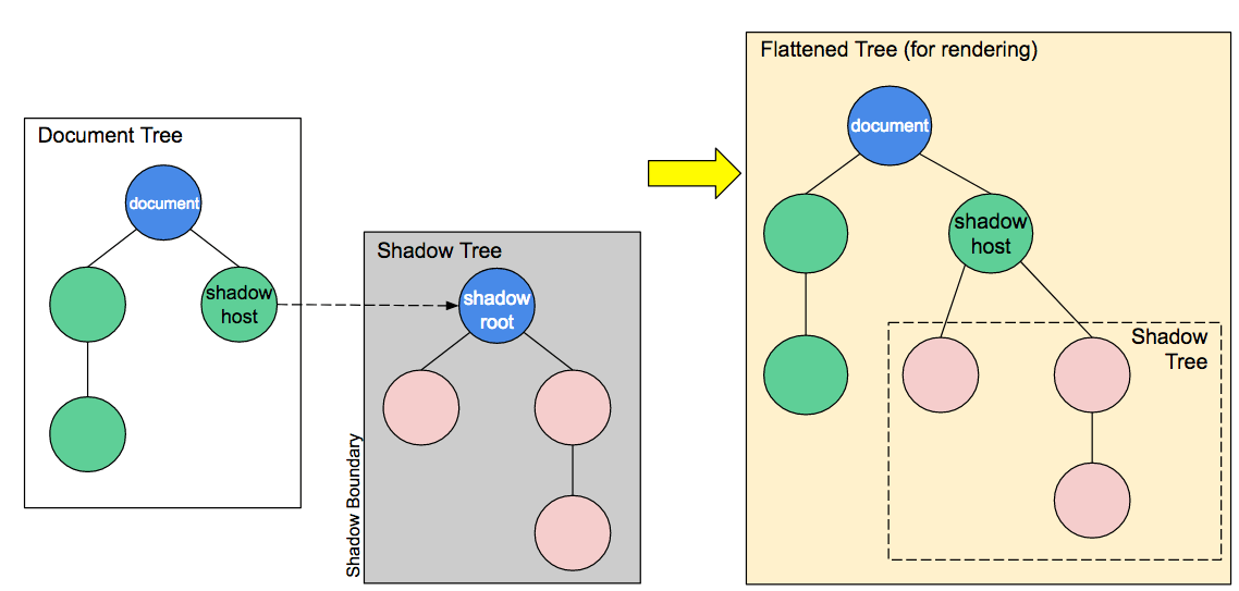
- Shadow DOM(影子 DOM):一组 JavaScript API,用于将封装的“影子”DOM 树附加到元素(与主文档 DOM 分开呈现)并控制其关联的功能。通过这种方式,您可以保持元素的功能私有,这样它们就可以被脚本化和样式化,而不用担心与文档的其他部分发生冲突
- HTML templates(HTML 模板):
<template>和<slot>元素使您可以编写不在呈现页面中显示的标记模板。然后它们可以作为自定义元素结构的基础被多次重用
三、生命周期
- connectedCallback:当 custom element 首次被插入文档 DOM 时,被调用
- disconnectedCallback:当 custom element 从文档 DOM 中删除时,被调用
- adoptedCallback:当 custom element 被移动到新的文档时,被调用 (移动到 iframe 中)
- attributeChangedCallback:当 custom element 增加、删除、修改自身属性时,被调用
四、使用方法
- 使用 CustomElementRegistry.define() 方法注册您的新自定义元素 ,并向其传递要定义的元素名称、指定元素功能的类、以及可选的其所继承自的元素
- 使用 Element.attachShadow() 方法将一个 shadow DOM 附加到自定义元素上。使用通常的 DOM 方法向 shadow DOM 中添加子元素、事件监听器等等
- 使用
<template>和<slot>定义一个 HTML 模板。再次使用常规 DOM 方法克隆模板并将其附加到您的 shadow DOM 中
1 Custom elements
- 具体教程
- custom elements 含义为自定义标签
- 主要通过 CustomElementRegistry 接口中的 CustomElementRegistry.define(name, class, extends) 方法来注册一个自定义元素,具体参数如下:
- name 自定义元素名称,名称不能是单个单词,必须用中横线隔开,避免与 native 标签冲突
- class 自定义元素的类
- extends 可选参数,指定继承的已创建的元素,被用于创建自定义元素
js
// 语法
customElements.define(name, constructor, options);

// 案例
window.customElements.define("lxh-button", LxhButton);2 Shadow DOM
- Shadow DOM 可以实现真正的隔离机制,即隐藏 DOM 树
js
// 案例
class LxhButton extends HTMLElement {
  constructor() {
    super();
    // 1 创建影子
    let shadow = this.attachShadow({ mode: "open" });

    // 2 获取或者创造页面元素
    let btn = document.getElementById("btn");
    let cloneTemplate = btn.content.cloneNode(true); // 拷贝模板
    shadow.appendChild(cloneTemplate);

    // 3 编写样式
    const style = document.createElement("style");
    style.textContent = `
			.btn-wrapper {
				position: relative;
			}
			.btn {
				// ...
			}
		`;
    shadow.appendChild(style);
  }
}3 HTML templates
- 具体教程
- template 中的内容就是自定义的组件内容,slot 为组件插槽,可以插入到模板对应的位置
js
// 案例
<lxh-button type="primary">自定义原生按钮</lxh-button>

<template id="btn">
    <button class="btn-wrapper">
        <slot>按钮</slot>
    </button>
</template>五、自定义按钮-Button
html
<!DOCTYPE html>
<html lang="en">
  <head>
    <meta charset="UTF-8" />
    <meta http-equiv="X-UA-Compatible" content="IE=edge" />
    <meta name="viewport" content="width=device-width, initial-scale=1.0" />
    <title>Document</title>
  </head>

  <body>
    <style>
      /* 用户自定义最外层的样式 */
      :root {
        --background-color: black;
        --text-color: yellow;
      }
    </style>

    <!-- 使用组件 -->
    <lxh-button type="primary">自定义原生按钮</lxh-button>

    <!-- 自定义组件模板 -->
    <template id="btn">
      <button class="btn-wrapper">
        <slot>按钮</slot>
      </button>
    </template>

    <script>
      class LxhButton extends HTMLElement {
        constructor() {
          super();
          // 1 创建影子
          let shadow = this.attachShadow({ mode: "open" });

          // 2 获取模板按钮元素
          let btn = document.getElementById("btn");
          // 由于dom操作具备移动性,所以需要拷贝一份
          let cloneTemplate = btn.content.cloneNode(true);
          shadow.appendChild(cloneTemplate);

          // 3 编写样式
          const style = document.createElement("style");
          // 获取组件中传入的属性type
          let type = this.getAttribute("type") || "default";

          // 定义不同类型的样式
          const btnList = {
            primary: {
              background: "#409eff",
              color: "#fff",
            },
            default: {
              background: "#909399",
              color: "#fff",
            },
          };
          // 使用样式,如果最外层没有传入,就使用默认的
          style.textContent = `
                    .btn-wrapper {
                        outline:none;
                        border:none;
                        border-radius:4px;
                        padding:5px 20px;
                        display:inline-flex;
                        background:var(--background-color, ${btnList[type].background});
                        color:var(--text-color, ${btnList[type].color});
                        cursor:pointer
                    }
                `;
          shadow.appendChild(style);
        }
      }

      // 注册自定义组件
      window.customElements.define("lxh-button", LxhButton);
    </script>
  </body>
</html>六、折叠面板-Collapse
- 难点:子组件与父组件通信,使用自定义事件派发机制
1 目录结构
sh
├─collapse.html
├─collapse.js
├─collapse-item.js
├─index.js2 具体代码
collapse.html
html
<!DOCTYPE html>
<html lang="en">

<head>
	<meta charset="UTF-8">
	<meta http-equiv="X-UA-Compatible" content="IE=edge">
	<meta name="viewport" content="width=device-width, initial-scale=1.0">
	<title>Document</title>
</head>

<body>
	<!-- 使用组件 -->
	<lxh-collapse>
		<lxh-collapse-item title="Node" name="1">
			<div>nodejs welcome</div>
		</lxh-collapse-item>

		<lxh-collapse-item title="react" name="2">
			<div>react welcome</div>
		</lxh-collapse-item>

		<lxh-collapse-item title="vue" name="3">
			<div>vue welcome</div>
		</lxh-collapse-item>
	</-collapse>

	<!-- 组件模板:没有实际意义, 不会渲染到页面上 -->
	<template id="collapse_tmpl">
		<div class="lxh-collapse">
			<slot></slot>
		</div>
	</template>

	<template id="collapse_item_tmpl">
		<div class="lxh-collapse-item">
			<div class="title"></div>
			<div class="content">
				<slot></slot>
			</div>
		</div>
	</template>

	<!-- 引入JS -->
	<script src="./index.js" type="module"></script>
</body>

</html>index.js
js
import Collapse from "./collapse.js";
import CollapseItem from "./collapse-item.js";

// 注册组件
window.customElements.define("lxh-collapse", Collapse);
window.customElements.define("lxh-collapse-item", CollapseItem);

// 设置组件默认显示的状态
let defaultActive = ["1", "2"]; // name:1 name:2 默认展开 3 应该隐藏
document
  .querySelector("lxh-collapse")
  .setAttribute("active", JSON.stringify(defaultActive));

// 每个item需要获取到defaultActive 和自己的name属性比较,如果在里面就显示,不在里面就隐藏
document.querySelector("lxh-collapse").addEventListener("changeName", (e) => {
  let { isShow, name } = e.detail;
  if (isShow) {
    let index = defaultActive.indexOf(name);
    defaultActive.splice(index, 1);
  } else {
    defaultActive.push(name);
  }
  document
    .querySelector("lxh-collapse")
    .setAttribute("active", JSON.stringify(defaultActive));
});collapse.js
js
class Collapse extends HTMLElement {
  constructor() {
    super();
    const shadow = this.attachShadow({ mode: "open" });

    const tmpl = document.getElementById("collapse_tmpl");
    let cloneTemplate = tmpl.content.cloneNode(true);
    shadow.appendChild(cloneTemplate);

    let style = document.createElement("style");
    // :host 代表的是影子的根元素
    style.textContent = `
            :host{
                display:flex;
                border:3px solid #ebebeb;
                border-radius:5px;
                width:100%;
            }
            .lxh-collapse{
                width:100%;
            }
        `;
    shadow.appendChild(style);

    // 获取slot,监控slot变化
    let slot = shadow.querySelector("slot");
    slot.addEventListener("slotchange", (e) => {
      this.slotList = e.target.assignedElements();
      this.render();
    });
  }

  // 监控属性的变化
  static get observedAttributes() {
    return ["active"];
  }
  // 属性更新
  attributeChangedCallback(key, oldVal, newVal) {
    if (key == "active") {
      this.activeList = JSON.parse(newVal);
      this.render();
    }
  }
  // 重新渲染方法
  render() {
    if (this.slotList && this.activeList) {
      [...this.slotList].forEach((child) => {
        child.setAttribute("active", JSON.stringify(this.activeList));
      });
    }
  }
  // connectedCallback(){
  //     console.log('插入到dom时执行的回调')
  // }
  // disconnectedCallback(){
  //     console.log('移除到dom时执行的回调')
  // }
  // adoptedCallback(){
  //     console.log('将组件移动到iframe 会执行')
  // }
}
export default Collapse;collapse-item.js
js
class CollapseItem extends HTMLElement {
  constructor() {
    super();
    let shadow = this.attachShadow({ mode: "open" });

    let tmpl = document.getElementById("collapse_item_tmpl");
    let cloneTemplate = tmpl.content.cloneNode(true);
    shadow.appendChild(cloneTemplate);

    let style = document.createElement("style");
    style.textContent = `
            :host{
                width:100%;
            }
            .title{
                background:#f1f1f1;
                line-height:35px;
                height:35px;
            }
            .content{
                font-size:14px;
            }
        `;
    shadow.appendChild(style);

    // 一些初始化变量
    this.isShow = true; // 标识自己是否需要显示
    this.titleEle = shadow.querySelector(".title");

    this.titleEle.addEventListener("click", () => {
      // 如果将结果传递给父亲  组件通信?
      document.querySelector("lxh-collapse").dispatchEvent(
        new CustomEvent("changeName", {
          detail: {
            name: this.getAttribute("name"),
            isShow: this.isShow,
          },
        })
      );
    });
  }

  // 监控属性的变化
  static get observedAttributes() {
    return ["active", "title", "name"];
  }
  // 属性更新
  attributeChangedCallback(key, oldVal, newVal) {
    switch (key) {
      case "active":
        this.activeList = JSON.parse(newVal); // 子组件接受父组件的数据
        break;
      case "title":
        this.titleEle.innerHTML = newVal; // 接受到title属性 作为dom的title
        break;
      case "name":
        this.name = newVal;
        break;
    }
    let name = this.name;
    if (this.activeList && name) {
      this.isShow = this.activeList.includes(name);
      this.shadowRoot.querySelector(".content").style.display = this.isShow
        ? "block"
        : "none";
    }
  }
}
export default CollapseItem;